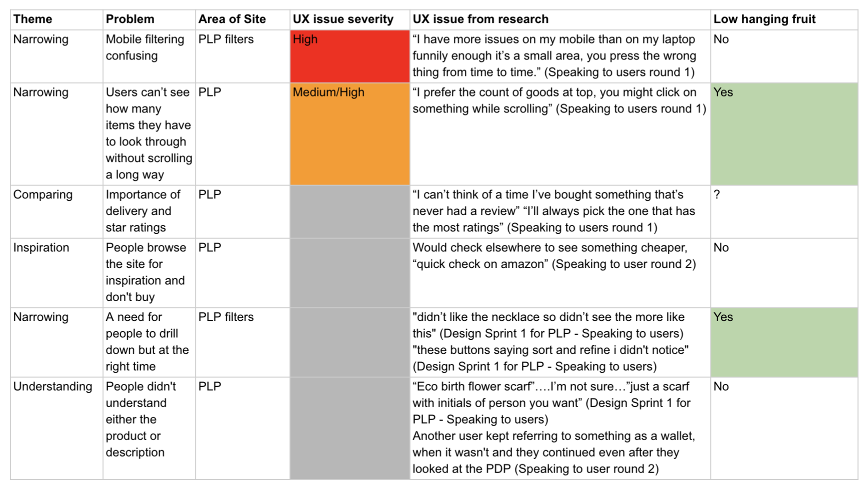
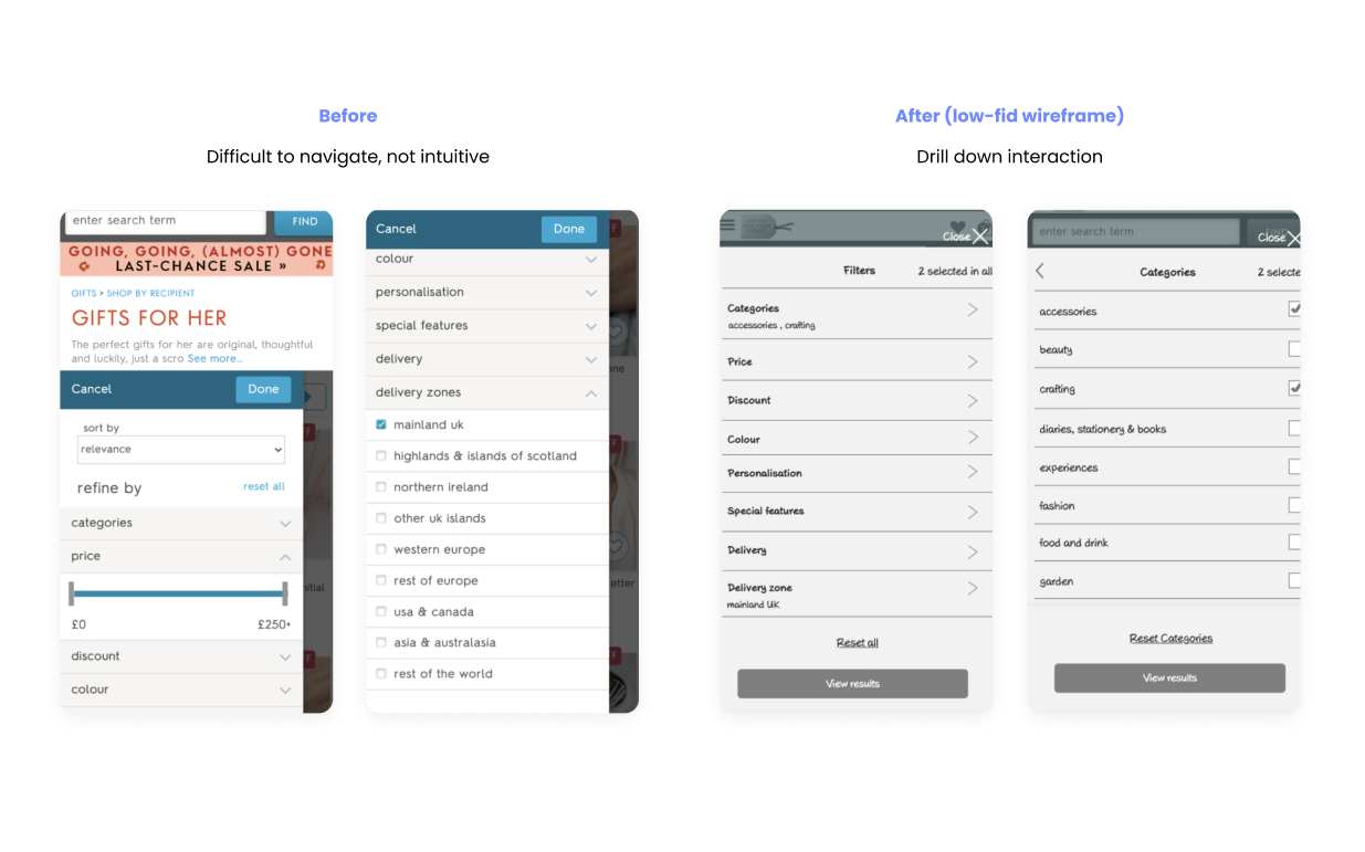
Notonthehighstreet.com is an e-commerce marketplace with handcrafted and bespoke sellers of all sizes (similar to Etsy but more vetted). I was in charge of leading the UX design for several high-traffic pages during a major re-platforming initiative. These pages collectively receive 74% of the website’s traffic. In this case study, I will focus on a category of pages called Product Listing Pages (PLP).


Project aim

For customers : Help shoppers effectively drill down in their verticals of interest, in order to find and purchase their perfect item/s.
For business : Release of a single unified listings application (to support all product listing page categories), while ensuring CVR (Cost value reconciliation) equals control or higher.

My role

I was leading the UX for this project. I had to get designs approved from Product Manager, Head of Product and Product Design and was responsible for liaising with relevant parties, such as Developers or Analytics in order to collect the correct data and insight in order to inform design decisions.

I created several UX deliverables including journey maps for particular journeys, interactive low-fi prototypes, research reports (working with User Researcher).

Project team and stakeholders included : 1 Head of Design, 1 Head of Product, 1 Principle Visual Designer, SEO team, A team of Developers, Marketing team

Snapshot of my responsibilities

UX Design and testing

  • Competitor analysis
  • Best practice reviews
  • Interactive lo-fi prototypes (as wireframes)
  • User testing (Analysis and gathering research questions)
  • Weekly reviews with PM, Principle Designer and Head of Product & Product Design. Liaising frequently with stakeholders.

Visual Design testing

  • Helping create the new Design System by validating and testing the parts of the system via User research.

Production and Presenting

  • Ironing out UX issues with developers
  • Presenting back how and why we made certain decisions to wider stakeholders and company wide calls including the CEO

Challenges and approach

NOTHS (Notonthehighstreet.com) has 3 different types of Product Listing Pages (PLP)

  • Category listing or CLP pages – (accessed through category selection)
  • Search listing or SLP pages – (accessed through search)
  • Partner Store front or PPLP pages – (accessed when partner/seller name is clicked)

These were the project aims for user experience :

Improve the UI and Experience

Have a mobile first approach as this is where most sales are made.
Fix fundamental usability issues in order to allows users to find their perfect products.

Build with future in mind : Laying foundations for a system

Design in a flexible way based on components to support future design system work
Consider future requirements (SEO, VM, UX) to support future business needs.

Support rebuild

There are multiple applications and code bases for each of these. Unify these in design (and tech) so that they can be easily updated.

Time constraints meant we had to be lean in our decision making for the PLP, as a team we found ways to quickly validate ideas and work with the development team who were already preparing the backend.

In order to collaborate on this new project quickly, we chose to run a week long design sprint.

The view below shows you what one of the Category listing pages looked like :

Discovery through a cross collaborative mini-sprint

We kicked off the project by doing a week long abridged online Design Sprint. (For this PLP Design Sprint I was a key presenter, later I arranged and moderated the design sprint for the Product detail pages).

The Sprint sessions involved people from all involved teams: Product, Developers, SEO, Marketing and Customer Service.

As part of preparation for the sprint. We needed to understand how we can better serve our customers : to explore, personalise and purchase their perfect gift.

In order to do this we used the following methods for primary research, and I presented the highlights at the Sprints along with the User Researcher.

Moderated User Inteviews

I worked with the User Researcher to form questions and gather analysis specific to the pages we were redesigning. This was part of a larger generative study to understand user behaviour during the conversion funnel process (exploration, decision making and purchase).

Interviews with Customer Service

The Customer Service team were able to give us a clear list and view of all the most common and critical issues that users face in specific parts of their journey. We also followed up by asking more specific questions about pages or certain problems.

I worked with the user researcher to form tasks and analyse the data from users. We presented these problems to the stakeholders in the sprint.

“I prefer the count of goods at top...you might click on something while scrolling.”

Anon User, during user interviewUsers were observed trying to scroll all the way up on mobile, in order to see how many results they had to narrow down. They had no way of knowing this at the bottom of the page.

“I got bored of it, you search and you search and you search and you can't find anything you like”

Anon Userduring user interview Users were observed with difficulty in narrowing down their searches due to items with improper search tags and categorisation difficult to navigate.

“I have more issues on my mobile than my laptop...it's a small area, you press the wrong button from time to time”

Anon Userduring user interview Sort and refine was not intuitive and featured fiddly interactions (such as price)

User testing and speaking to stakeholders, revealed the biggest pain points. These are some very high level considerations :

  • Reduce confusion of categories by removing repetitive component on desktop
  • Allow for easier pagination and filtering interactions
  • Consider how different delivery options (and seasonal urgency) will change with the filters
  • Rethink interactions of what happens when item is not available in the country of choice or where the customer is ordering from. Support shoppers who need urgent gifts.

Using our learnings to define the MVP

As a result of the sprint and discussions of data points and pain points, we formed ideas. My job was to create some key prototypes which was than tested with users promptly for the sprint. Once tested, the feedback was presented to the wider team.

All of this formed a basis of understanding for which aspects should be prioritised, the Product Manager used this to prioritise aspects based on stakeholder requirements.

Below you can see how these fed into a more prioritised list of usability issues. I looked at which items could be low effort but high in impact (using an impact vs effort matrix). This was then used by the Product Manager (PM) to prioritise features and user stories.

Design iterations

So how do we decide what are the best solutions for MVP?

We knew early on that we needed to upgrade the NOTHs website to match or exceed its competitors, so I focused on reviewing leading websites and best practices to understand how they were solving issues that we were seeing users state from the user interviews.

This provided us with solutions to common problems, which I then made interactive prototypes for and iterated on in order to test with users and get the team onboard. It was a mix of the following activities :

Prioritised user stories and collaborating with PM

Competitor Analysis and case study reviews

Low-Fi wire-framing and interactive prototyping

User testing

Sharing results and getting stakeholders on board

Iterating the PLP: between SLP, PPLP and CLP

Overall the following changes were made through design iterations

Bringing hierarchy to guide the user :

Although we could not hide the repetition of categories as we were constrained due to SEO concerns, we managed to make it more discreet. We also made interaction decisions such as having the “filter” and “sort” as a sticky, once the user scrolls up on mobile. To recognise their intent of not having found what they need (better shown in live site).

Better transparency :

Making important information such as the number of products and the applied filters more transparent and intuitive to users, by carefully considering its placement and design. Separating “Filter” and “Sort” to make it better aligned with competitor sites and user mental modal.

Reducing friction :

A new style of pagination to encourage exploration and simplify the experience of browsing. The process went through regular feedback and once we had a high level of confidence with our chosen design, we put it through User testing.com. I created an interactive wireframe prototype using Axure Pro. The purpose of this was to show different components interactively and use the chosen versions to collate a final version. It provided an easy way to view wireframes interactively via different responsive device view ports.

Below you can see how these principles were implemented in my lo-fi interactive prototype.

Final Designs

Rollout and Impact

The redesigned Category pages were rolled out and A/B tested against the old Category pages.

Although this page itself performed with no significant difference, it turns out that when looked at through the whole journey, there was a positive uplift of people purchasing the products on the product listing pages, due to the new category page design.

3
more TTV per user uplift
41,000
more £ per week at 100% of users (circa)
2,000,000
more £ per year (circa)