Project aim
For designers : Provide a frame of reference, and source of truth for all their future and current designs.
For business : Improve speed and operations due to a unified system.
For developers : Provide visibility of the components and rules that will be present across the designs.
My role
I was a Visual Designer in this project and worked with another Visual Designer in tandem in order create the design system from scratch. We had to report to the Head of Design and Head of Visual Design. I also used my UX skills to audit and problem solve through complex component logics.
Project team included : 1 Head of Design, 1 other Visual Designer
Challenges and approach
The internal design team did not have design system or UI kit. Designers copy pasted from each other’s files in order to maintain consistency and style across different projects. We worked in an augmented team setting, and our challenge was to create a unified system for the design team to use.
We were also asked to create the system in Figma so that it could be independent and self-sufficient. Business decisions on other software (such as Zero height or alternatives) were pending review, but we know that during handover and governance stage at the end of the project the system would have to be prepared for such decisions.
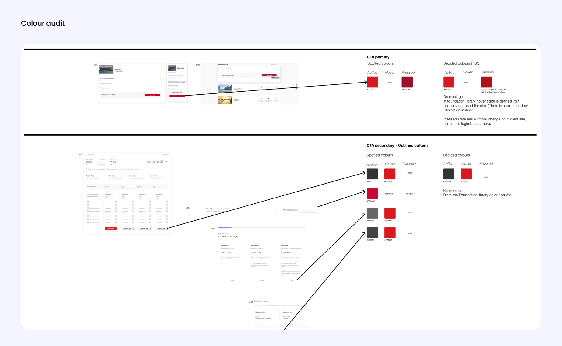
Auditing current patterns
We carried out various activities in order to pull together what has been done already and what needs to be done to align and unify the design decisions :
- Reviewed Visual Direction given by internal design team
- Reviewed any layout and visuals across various files (sketch, figma, zeplin, live site)
- Mapped all the current pages of the site in order to Catalog Components
- Reviewed Figma Structure of current design files
- Reviewed accessibility compliances


Defining the path forward
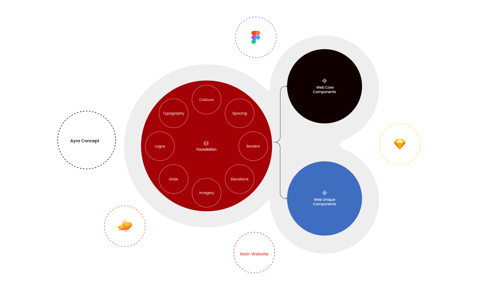
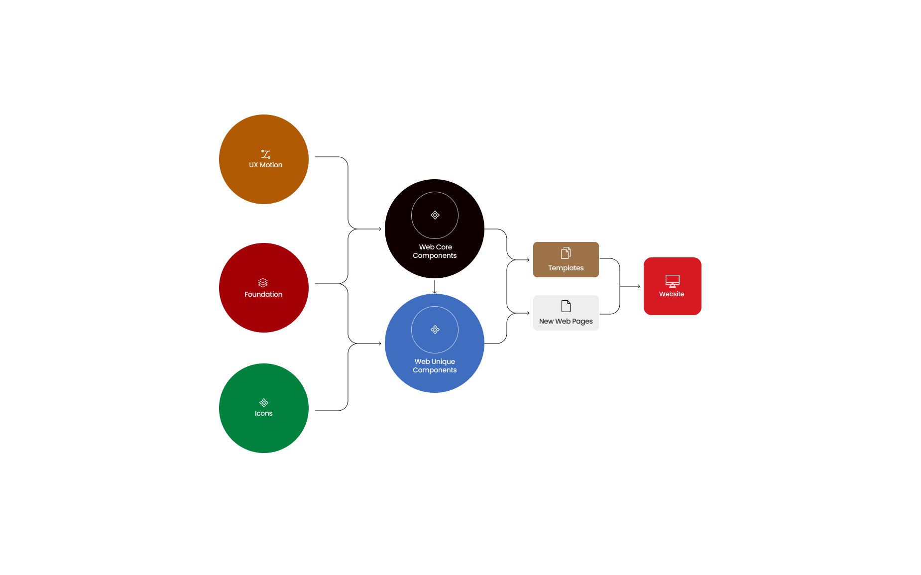
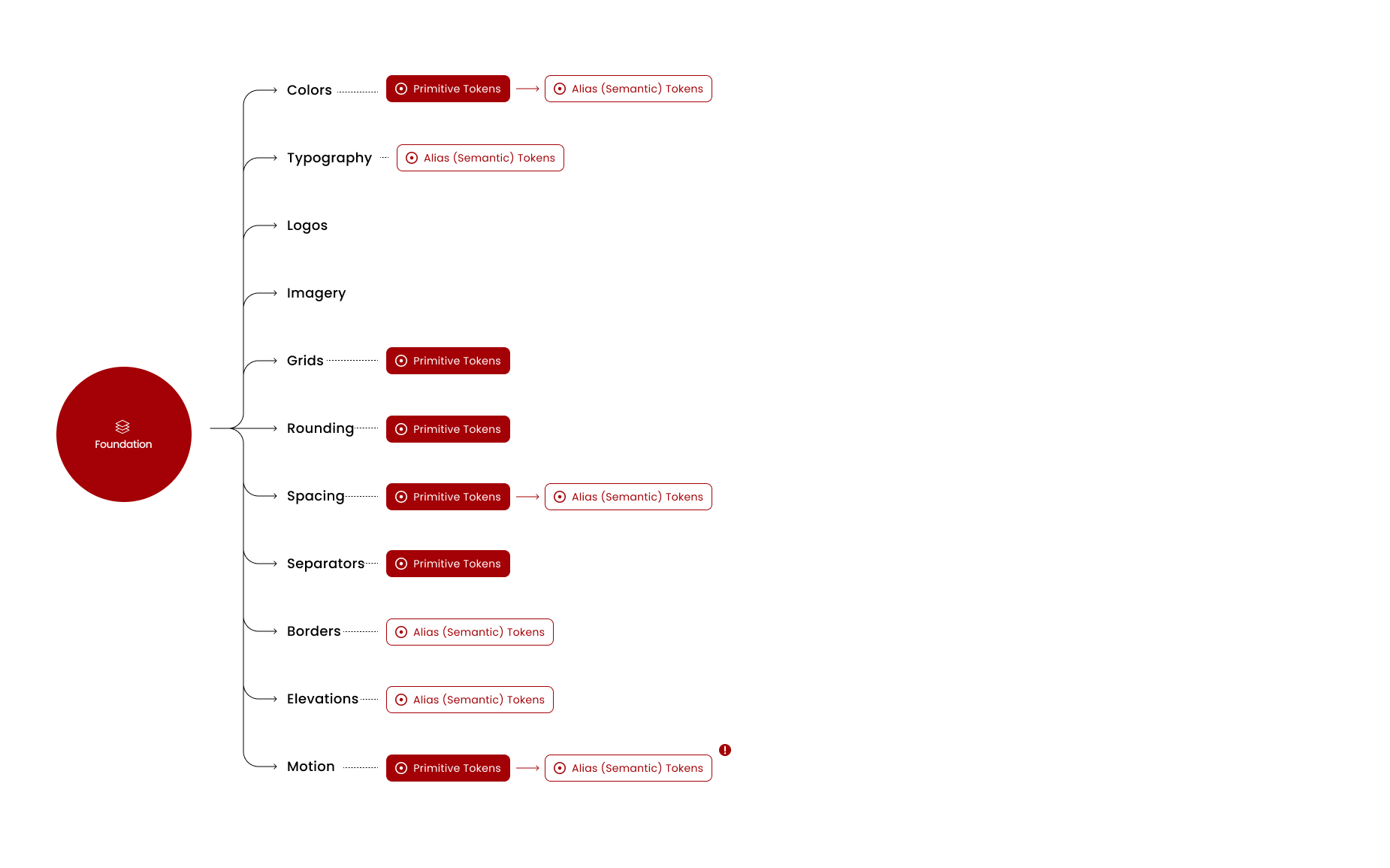
- Agreed on Design System Figma structure and name conventions (i.e tokens and layouts)
- Defined project rituals and approvals
(weekly meetings and touchpoints) - Plugin library definition
- Defined motion documentation structure
- Prioritised and planned according to page sections
Execution and testing
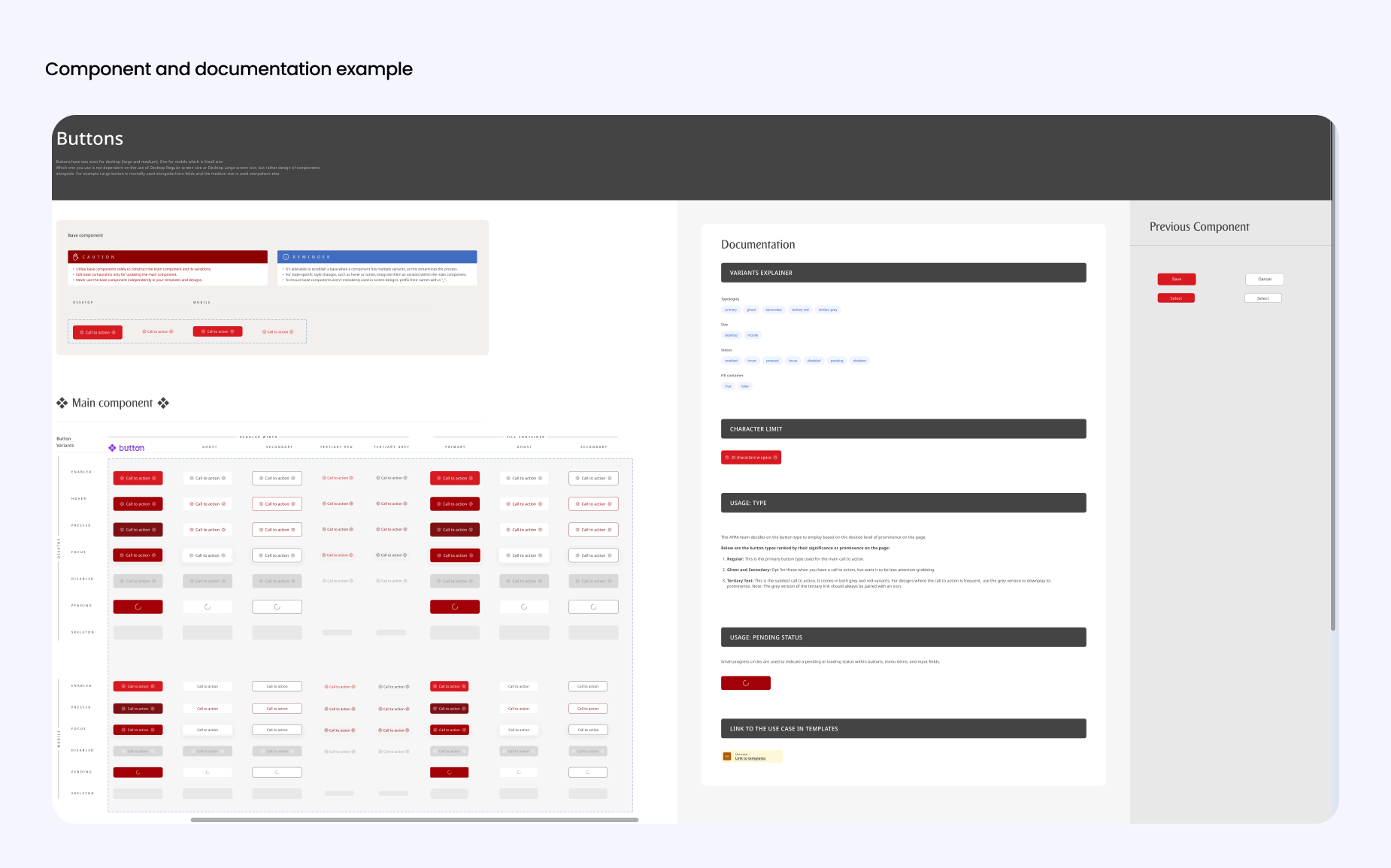
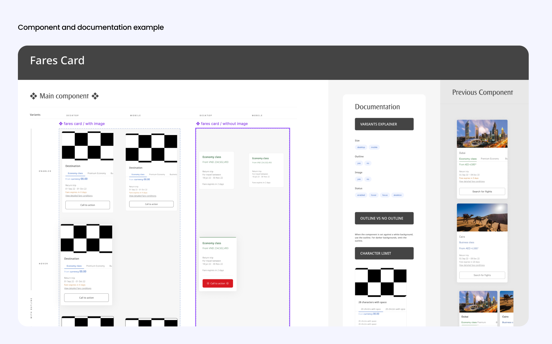
We created and documented across Foundations → Components → Templates
- Identified, migrated and translated components from sketch/figmafiles
- Setting the foundations
- Component design
- Layout design
- Motion design
- Stress testing
- Running short user tests and observation
- Validation and Approval


Teaching and preparation for governance
Onboarding tools for continuous adoption
- Educating designers on best practice for version control and insertions in design system
- Creating onboarding documentation
- Creating video tutorials
- Advising on next steps on tools (such as Zero Height) and team structure.
Rollout and Impact
3
Approx 3 times faster workflow : 3 designers took 2 weeks to design 200+ screens with the System
43
Used by around 43 project teams
234
Components created (including variants) this is more than we would like but it was necessary for the team
17
Further Design Systems for sub-brands and further augmented projects due to value gained from this
Learnings
Upon reflection, these are things I would have done differently.
- Advocated for time to investigate proper automation features. For example we abandoned a key plugin half way in the project because it proved to be buggy and was providing issues with permissions in the clients office. I would have advocated for time to investigate or allocate some money to this to be done properly, because it provided value when scaling the system beyond web.
- Furthered the naming conventions of tokens to think about how it could go beyond desktop, web and app (not just web as was in scope). Additional time would also have to be factored in order to do this.